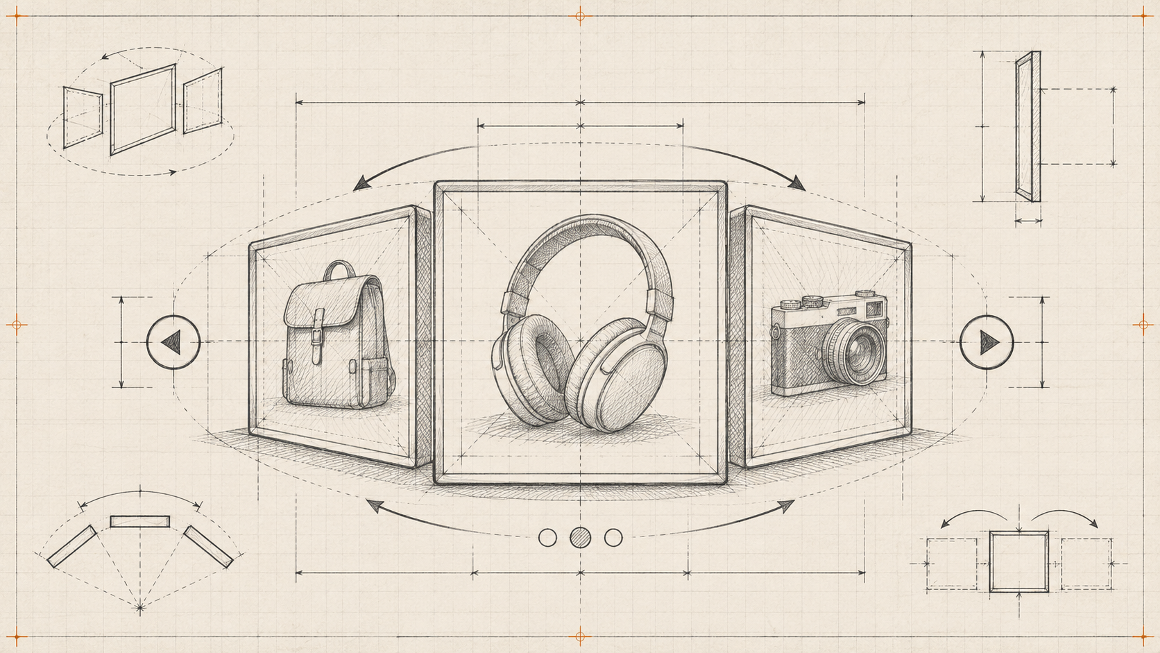
A carousel should help people compare products. If cards spin away while someone is reading a price, the animation is working against the task.
Establish the plain version first
Start with a semantic list of product links. Give each item a name, image and relevant price or variant information. The page should remain useful before the carousel script starts.
Add previous and next buttons with descriptive labels. Keep the active product obvious, and show position in the set when it helps orientation. Swiping can supplement buttons, not replace them.
Treat motion as a choice
Prefer user-initiated movement for a shopping comparison. If the design includes automatic rotation, provide a clear pause control and follow accessible carousel guidance for focus and hover behaviour. Respect reduced-motion preferences when adding depth transitions.
Do not move keyboard focus just because the visual slide changed. Avoid leaving controls in visually hidden cards reachable in a confusing order.
Keep product state consistent
Selecting a variant should update its image, price and destination together. Put the purchase action inside the corresponding product context. A large floating button that silently targets a different card is an easy mistake to miss in a demo.
Test the first and last items, keyboard navigation, a single-product collection and long translated titles. Compare the carousel with a simple grid using a real shopping task. Sometimes the most useful improvement is showing more products at once.