A beautiful property tour creates interest. Outdated availability wastes it. For a rental website, the difficult part is keeping the promise made by the gallery consistent with the booking process.
Model the rentable unit
Decide whether a booking reserves a whole property, a room or a specific item. Define check-in dates, time zone, minimum stay and cleaning gaps before designing the calendar. Otherwise the UI will quietly invent rules the operation cannot honour.
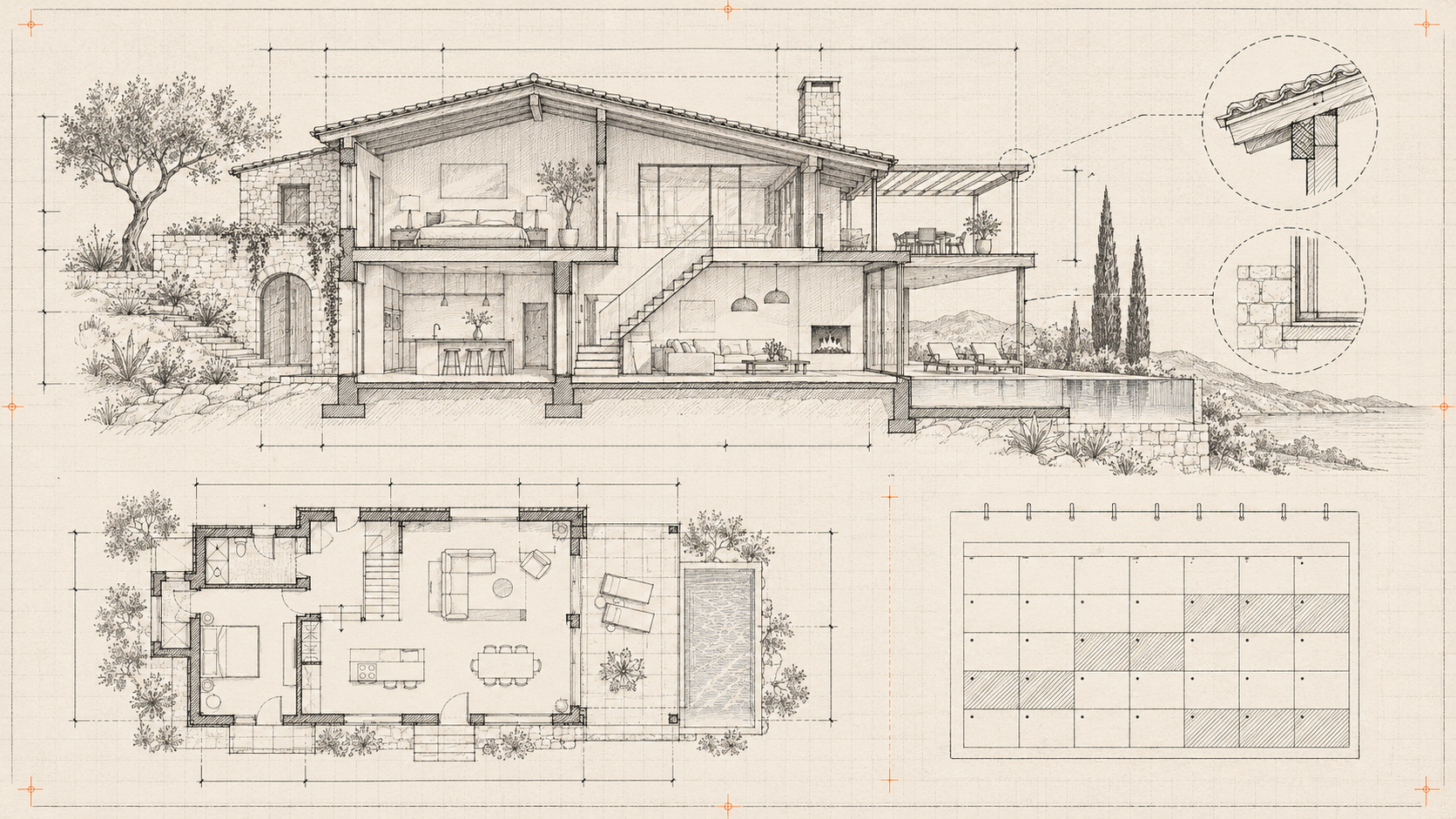
Use images and a floor plan as the baseline. Offer a 3D walkthrough when it helps explain layout or access, with a visible way to skip it.
Distinguish availability from a reservation
A calendar result is a snapshot. Recheck availability when a booking is submitted. If the workflow uses temporary holds, give them an explicit expiry and release them reliably. Store the booking state independently from email delivery.
For an enquiry-only website, say “request these dates” rather than implying an instant confirmed reservation. That small wording decision prevents a large expectation gap.
Put the real conditions near the action
Explain deposits, cancellation terms, included services and extra charges before submission. Do not bury them behind an animated reveal. Provide a text alternative for details conveyed by the tour.
Test two people requesting the last available period, a timed-out confirmation and a booking crossing a date boundary. Measure completed, qualified requests rather than time spent rotating a model. The right preview helps a guest decide; the booking system must then keep up.